CanDSim
Poster from the SMDM 2023 European Conference
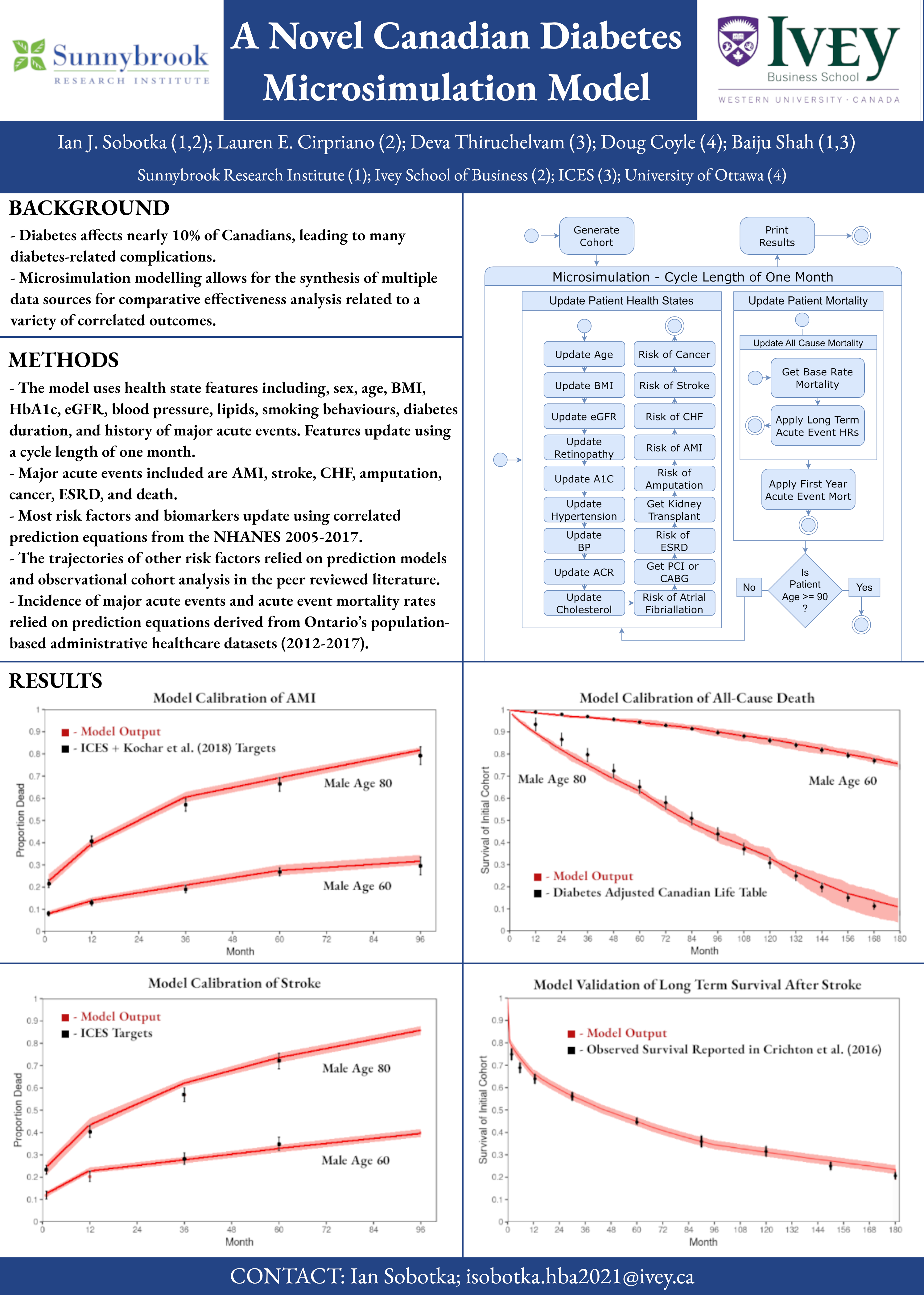
Results Discussion
The graphs on the left side of the poster represent two of the major acute event calibration targets. These graphs illustrate cumulative all cause mortality following an event at time 0. The y axis represents the proportion of patients who have died, and the x axis represents time in months up to 8 years
The black dots with error bars are calibration targets from ICES representing the proportion of patients who died by at 1 month, 1 year, 3 years, and 5 years after a heart attack or stroke. We used LHS to identify the mortality hazard ratios that would achieve these targets in a cohort of patients with a history of these events.
The red line plus the ribbon represents the output of our model after calibration with a range of error based on 10 runs of 1,000 people using the best fitting hazard ratios identified through calibration as model inputs. As you can see, for each of the acute events, we are able to hit long term mortality targets.
The calibration output graph in the top right of the results section illustrates survival of a representative diabetic cohort when compared to overall mortality reported by Statistics Canada. In this graph, the y axis shows the proportion of the population still alve, and the x axis shows time in months up to 15 years. The black dots now represent Canadian reported all cause mortality adjusted by an age-specific multiplier, also reported by Statistics Canada, to account for the increased mortality experienced by diabetics. For the cohort of 80 year olds, you can see that uncertainty in the model begins to increase around the age of 90 (month 120) as sample size is low in the older ages.
The final graph represents model validation. To ensure that our model calibration effort was successful, we held back some literature values that could have been used for model calibration to use as model validation after calibration. In this graph, we present the the survival of a cohort of individuals who experienced a stroke at time 0. This graph compares the microsimulation model outputs using the best inputs identified in calibration to the data from Crichton et al. who reported the results of a population-based south london stroke registry. As you can see, the model performs well on all cause mortality after stroke.